Combining History and Tech in Higher Education Design

Neal Cross AIA, NCARB explains how careful planning and a deep understanding of design are crucial when mixing the old with the innovative, especially in higher education design. Making it happen on a university campus adds a twist to the challenge.
Higher education design relies more heavily on context than many other market sectors. University campuses are communities in their own right but they are also part of a much bigger picture. They are often steeped in tradition and history but must always look to the future. That dichotomy adds complexity and nuance to the design process. And it’s an experience that every architect should be lucky enough to have at least once in their career.
A Sector Unto Itself
Architects who typically work on commercial projects find that higher education is a completely different animal. Unlike private developers, who typically want a project done as soon as possible and in line with up-to-the-minute consumer trends, universities operate in terms of decades. Their long-term campus master plans need to align with far-reaching, complex financial and educational goals with buildings that need to last 100 years and beyond.
This was all certainly true at the University of Minnesota’s Institute of Child Development (ICD) at Campbell Hall. Our firm has been lucky enough to work with the University of Minnesota on several projects. Something that always strikes me is the extensive knowledge of the Capital Project Management team. They already have such a deep understanding of how buildings come together that we were able to have complex conversations about function, siting, sustainability and materiality. On the ICD project, the university truly collaborated with us. It was a team process. They asked us great questions and we all worked together to get to the right solution.

Tradition Meets the Latest Research
At the Institute of Child Development, bridging the gap between history and the future was a unique challenge. At the start, there was an original 1913 building with a 1960s addition. Over time, the addition started leaking and the elevations between the two buildings didn’t align, which made ADA compliance especially difficult.
The 1913 building is on the historic registry. Any changes we made had to be in line with the strict HPC review process. On top of that incredible history, the site is in the Knoll District, the university’s oldest area. 200-year-old oak trees grow across the site, which had great implications for the footprint of the new building. They also served as an inspiration to the design team.
The function of the building is also somewhat unique. Most university buildings cater to some combination of faculty and students. In this case, the building houses faculty offices, classrooms and student study areas, but it is also designed for research. This research brings in children and families who are visiting the facility as part of research studies. Our design brief was that the Institute of Child Development is about children, but it’s not for children. Our final design concept incorporates a playfulness that sparks curiosity and enjoyment for visiting children, but it still feels like a collegiate building where researchers and students are doing serious work that has long-ranging implications for the future of child development research.
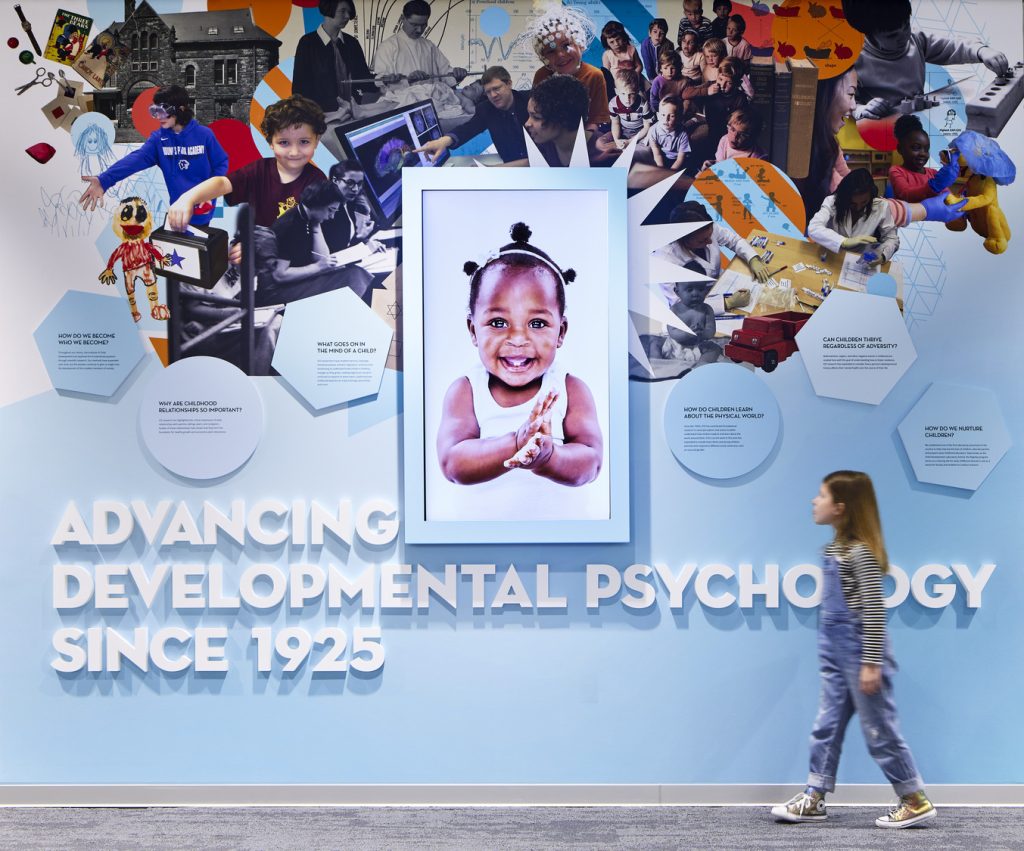
A Higher Education Design Story
From the very start of our process, the university made sure we had the opportunity to speak to all the stakeholders. We interviewed every single faculty member, who would eventually have their own research suite. These are all set up slightly differently based on function and preferences—some with larger communal tables, some with a different number of offices, all depending on the type of research being done. We also discussed the testing and control rooms at length. These would end up on the top two floors of the building and are something totally different from what we typically see in an academic building.
We designed the rooms for children from infants up to 18 years old to participate in behavioral research studies. The research covers many different aspects of child development, including behavioral and neurophysiological techniques such as eye-tracking and EEG. The rooms have speakers and one-way glass and are connected to a control room. We precisely coordinated the placement of cameras, microphones and other research equipment to make sure we properly captured researchers needs. We also designed waiting/playrooms adjacent to the testing rooms that are reserved for children and their families to relax in a comfortable environment when they are participating for hours at a time. During the design process, we found from the researchers that we would have to make sure that nothing would be overstimulating for the children (colors, lights and layouts) so as not to affect the results.
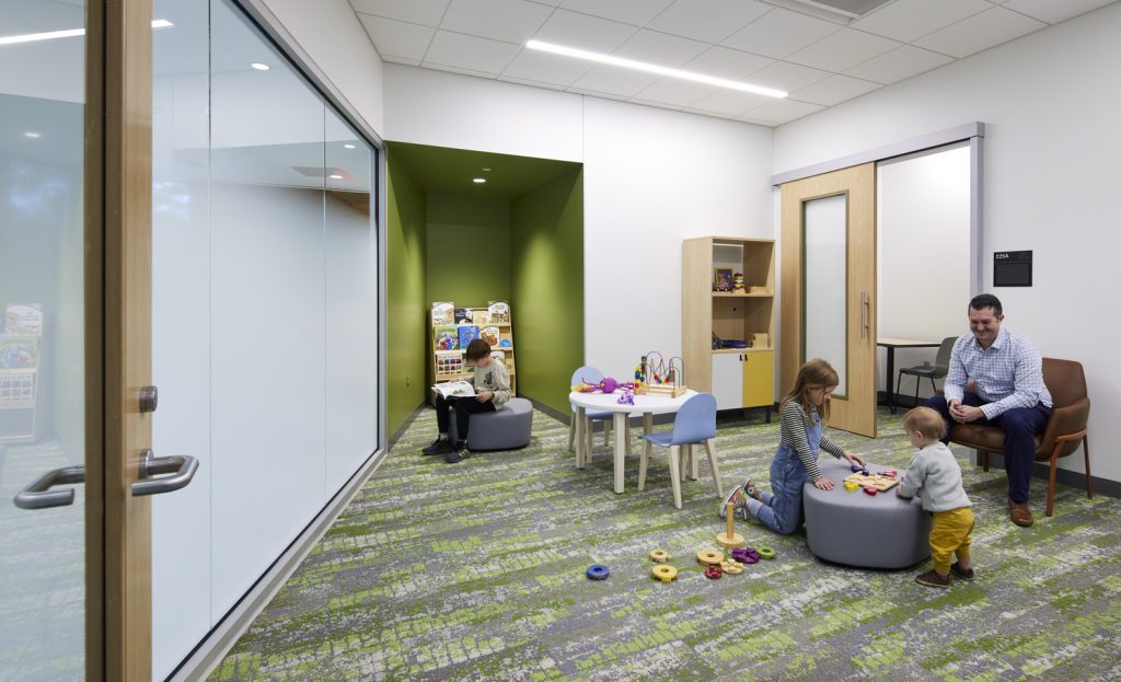
The original addition didn’t factor in having classroom in the building. Now they have two main classrooms in the building and a large conference room. It brings a lot of bustling life into the building, having undergraduate students taking classes, studying and spending time.
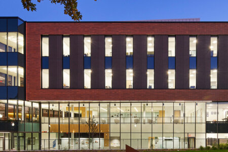
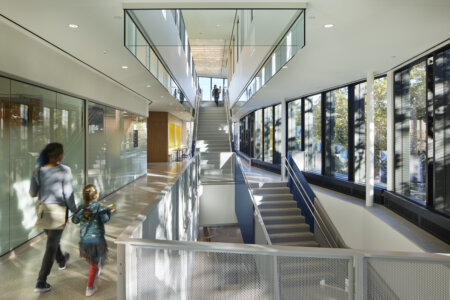
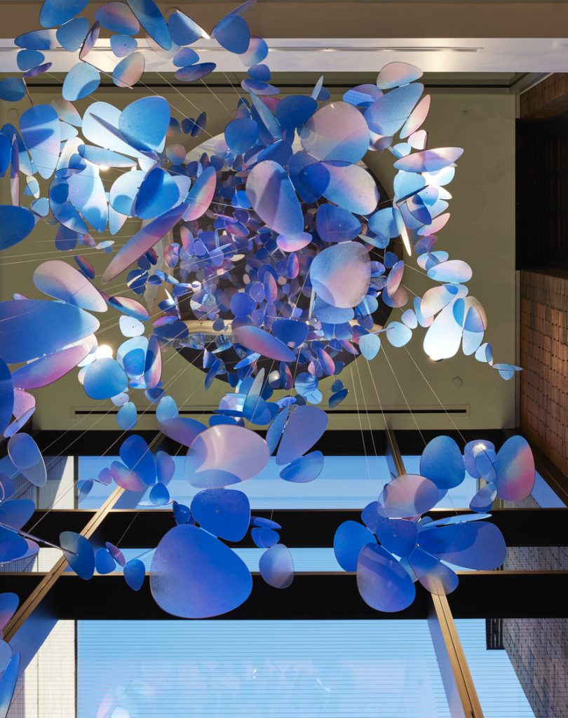
We also carefully designed the entrance to work for the variety of people utilizing the facility. The entry has clear sightlines from the family visitor parking stalls to the main entrance. From an architectural standpoint, we took inspiration from the historic oak trees surrounding the site. The east side of the building is all glass and exposes the grand communicating stairway up to the “tree house.” Looking at the stair from the outside immediately offers an understanding of how to navigate within the building. Back to the idea that the building is about children but not for children, we still wanted to inject a certain amount of whimsy; the stair is a bold blue and hanging sculptural butterflies make children (and everyone else) want to look up.
The Present and Future for the ICD and Higher Education Design
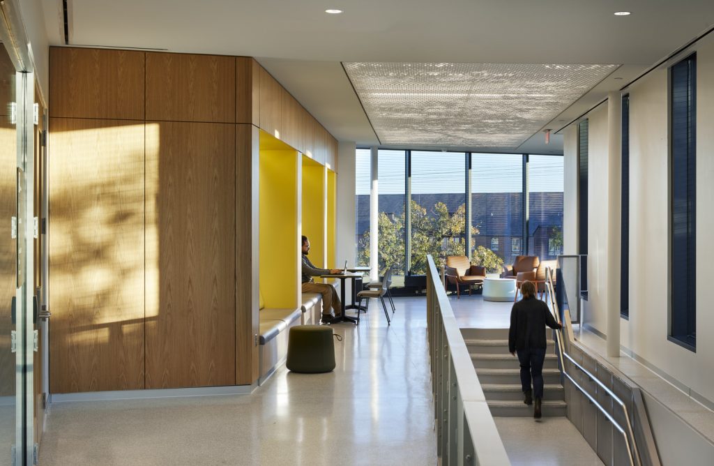
The building is now open and for all its intended purposes. The deliberate way we laid out the building to encourage interaction is working. Walking into the main entry on the first floor, professor offices line the historic building to the left so students can easily find them. Everyone uses the grand communicating stair to reach the research suites. Students used to sit on the floor in the old addition so we created a few different touch-down spots. In particular, we wanted the “tree house” to have what we called “hangoutability” with built-in banquettes and different furniture arrangements so students can study quietly, collaborate on research or just hang out.
And given the knowledge and future-focused planning of the university team, the building is B3 certified. For those that aren’t familiar, B3 is a tool and program designed to help make buildings more energy efficient and sustainable. B3 is required on State-funded projects in Minnesota. The tools is used throughout the design process to help inform sustainability decisions. It aims to be an integrated approach to design rather than a simple check list.
This process led to a number of sustainable design choices on the ICD project—all public rooms have either direct or secondary daylight. The building has a chilled-beam system to create energy-efficient heating and cooling. The team selected materials with high recycled content, glass that reduces solar heat gain and bird-safe glass. There is also inherent sustainability in reusing the 1913 building versus building from the ground up, not to mention the connections to bus lines and biking to encourage lower-emission transport options.
The ICD at UMN is the number one research university facility for child behavior in the country. They now have a building that will help their faculty continue their valuable research for decades. And the building can serve as a blueprint for higher education design at institutions across the country.


