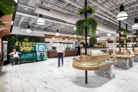
A Different Kind of Green: Cannabis Retail Design at The Flower Shop
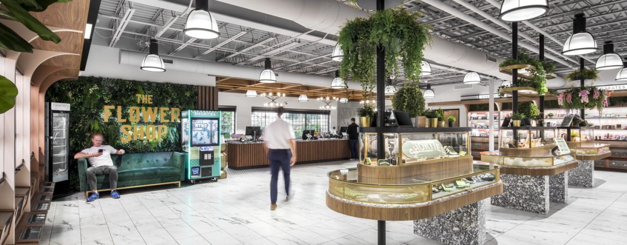
The Flower Shop combines a new model for cannabis retail design with major brand savvy. RSP’s Jason Ploszaj AIA, NCARB and Danielle McPeters NCIDQ, IIDA explain their approach.
The U.S. legal cannabis industry flattened slightly in 2022, thanks to pandemic-era restrictions, but, according to Brightfield Group, the market is estimated to reach over $31.8 billion in annual sales by the end of 2023, growing to $50.7 billion by 2028.
Extrapolate sales to economic impact and you can tack on another $100 billion in 2023. That’s up more than 12% from last year, and $160 billion in 2027. New York alone estimates that the industry could create as many as 60,000 new jobs by the end of the year. All of which demonstrates that recreational cannabis sales—and the follow-on spending, employment and tax revenues they generate—has emerged as a serious, competitive business.
And the future only looks bright.
The addressable market continues to grow—three more states legalized adult recreational use in 2022, and it may only be a matter of time before such use is legal across the country. Look at Canada! Here in the U.S., almost nine-in-ten Americans say marijuana should be legal for medical or recreational use, according to an October 2022 Pew Research survey. An overwhelming majority of U.S. adults (88%) say either that marijuana should be legal for medical and recreational use (59%) or that it should be legal for medical use only (30%).
And, of course, with this new economic vigor comes a more sophisticated retail model, a more educated and discerning consumer, and a more enriched customer experience. Gone are the black-light posters, beaded curtains and Grateful Dead soundtracks. They have been replaced by well-considered spaces that feel like a high-end patisserie or a jewelry store.
And that’s where RSP comes in.
Cannabis retail design at the flower shop
In February of 2021, Greta Brandt, president of The Flower Shop—a multi-state dispenser of cannabis and CBD products—challenged us to elevate the brand to keep pace with market demand, appeal to emerging consumers, and work toward changing the perception of the dispensary shopping experience. RSP’s prototype design, the first of which has been implemented with v2.0 on the way, feels like an approachable, yet sophisticated experience that caters to both established medical patients, while expanding to the evolving retail customer base.
Greta charged us to foster an empowering customer experience to appeal to a variety of users, especially women. The goal? Create a welcoming, comfortable space that attracts a more inclusive audience and showcases a curated (and ever-changing) selection of merchandise. The space is open and uncluttered. Customers are encouraged to browse, explore the wide range of products and seek advice from helpful budtenders. The flexibility of the layout allows a range of point-of-sale strategies. That includes a main counter, hand-held devices and even themed displays.
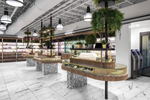
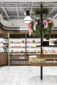
Transparency as well as natural and accent lighting play a crucial role in creating a gallery-like focus on the merchandise. But the custom casework sets the overall tone. Perimeter wall and free-standing, jewelry-like displays create an approachable, welcoming atmosphere that suggests a neighborhood apothecary. Abundant planting and sprays of greenery emphasize the floral theme and create a slightly cheeky visual pun on the brand.
the flower shop brand challenge
For designers in the cannabis retail space, it’s not easy keeping up with changing rules and regulations. Every state has different legal and transactional requirements that seem to change on an almost monthly basis. As one example, some regions don’t allow products to be visible from the street. It’s a credit to Greta and her team who have been able to navigate some pretty turbulent regulatory waters.
But, at its core, the design was a branding challenge.
“I didn’t want ‘dispensaries’ in our name, as that holds a negative connotation for many,” Brandt has said. And that’s why the sales space is light and bright. It focuses on access to information about the products, especially the health benefits unique to women.
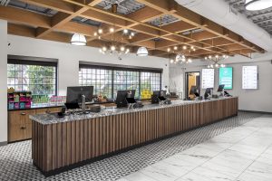
Understanding how vital education is for first-time users (and shoppers), the store’s aesthetics are just one part of helping people feel comfortable and respected. Each location has dedicated wellness experts to answer questions and recommend the right products. There are also ordering iPads, for guests who prefer a solo shopping trip.
One critical element of the design was flexibility, especially when it comes to customer feedback. The retailer takes reviews very, very seriously, often re-evaluating and adding new inventory based on them.
Product lines change quickly and new merchandise and products come to the floor regularly. We’ve even created a POS strategy that can accommodate a more traditional register and queue, as well as self-serve and roving budtenders with hand-held devices. It’s exactly the type of flexibility today’s multi-channel retailers need to respond to the latest trends and consumer expectations.
“We’re always tweaking and dialing in on the customer experience so that people leave with a really good impression,” says Brandt.
As we like to say, an ounce of thoughtful intent is worth a pound of design.
About the Authors
Jason Ploszaj AIA, NCARB, the Managing Principal for RSP’s Phoenix office, has a passion for sustainable and memorable solutions. And he is committed to mentoring the next generation of designers. His work ranges from large-scale planning to human-scaled details. Not to mention his pioneering projects that respect context, foster a sense of place, and enrich communities.
Danielle McPeters NCIDQ, IIDA has become an invaluable part of RSP’s Interiors team in Phoenix since joining in 2017. Her creativity and eye for design give her the kind of future-facing perspective needed for today’s rapidly changing markets and trends.
Featured Image: The Flower Shop, © 2023 Kyle Zirkus Photo


