50 South Sixth
Placemaking: inspired by the city
Across the country, multi-tenant buildings are struggling to stand out. To differentiate themselves, attract tenants and command competitive lease rates. Our environmental graphics team is collaborating with building owners to add a unique sense of place to repositioned properties. At 50 South Sixth in downtown Minneapolis, our team connected the interior amenities with downtown in a vibrant, fresh way.
The brand identity for the new amenity center – located on the building’s 9th floor – needed to be straightforward and identifiable for the multi-tenant tower. We took a simple communications approach, inspired by the abbreviations used in text and email: “Where is it? @9.” “Hey, do want to go grab lunch @9?” “I am going to go for a quick workout @9.”
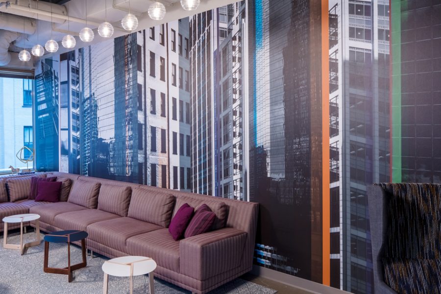
The reception features a three-dimensional round metal @9 logo and a custom geometric wall covering, which guides people into the lounge area. There, we photographed and designed floor-to-ceiling environmental graphics of the city skyline, evoking the energy and beauty of Minneapolis. This theme is carried through to the conference rooms, striped with colorful city maps and silhouettes of landmark buildings.
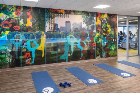
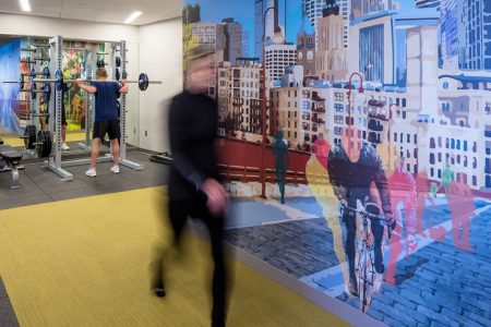
Animated wall coverings throughout the fitness center encourage energy and motion, with scenery inspired by the Grand Rounds trails that lace through the city. Starting with an abstracted collage of parks, lakes and the downtown skyline in the multipurpose workout studio. And a painterly vignette of cyclists on the Stone Arch Bridge in the cardio and weight rooms. These graphics add distinct color and character to the space, supporting the recruitment and wellness programs important to tenants, while also providing wayfinding and signage for easy access.
Client: Hines
Design Architect: DLR
Accolades: Excellence in Design Award, MNCREW, 2017; Biggest single-building real estate sale, 2017


