How Hotel Lobby Design Transforms the Guest Experience
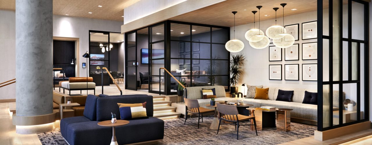
RSP’s Erin Yi says hotel lobby design is one of the most important changes happening in hospitality.
They are everywhere, infiltrating our world like a clone army methodically advancing across our eastern flank, promising to make life easier, faster, more efficient. They are in grocery stores, airports and restaurants, but that’s just the beginning. I’m talking, of course, about self-service kiosks. Or the apparatus that allows us to conduct business and complete simple transactions (buy groceries, check in/check out) with minimal to zero human interaction. To the introverts among us, they are a life-saver. For cynics, they’re a harbinger of the Robot Apocalypse. And for those of us who design hotel lobbies and fret over the ergonomics of a check-in desk, and the choreography of an arrival sequence, the jury is still very much out.
Introverts, Rejoice. Extroverts, Despair.
This idea of minimizing unnecessary human contact is nothing new, and the trend only picked up steam over the pandemic. Skift recently reportedthat 73% of the 5,000 guests they questioned said they were more likely to book into self-check-in hotels. A 2020 survey of 7,000 travelers revealed that 80% said they would prefer to use an app to check in. We also know that guest satisfaction plummets if there is even a short wait at check-in.
So, the appetite is there. And so is the need. But are these kiosks and self-serve convenience adding to the overall guest experience, especially when it comes to checking in (and out) of a hotel?
What’s a Lobby For, Anyway?
Just as it has to virtually every aspect of a hotel’s operations—and, by extension, the guest experience—technology is changing the way lobbies function and look; and perhaps no device has had a more profound impact on lobby design than the check-in kiosk. With the growing demand for mobile check-in and keyless entry—not to mention the library of services readily available via a handheld device—it would seem like the traditional check-in desk may soon be a thing of the past. Who needs those big, hulking desks that just slow things down and get in the way? We’re smarter than that. This is the age of the App.
But not so fast.
If the retail world, which has been relying on self-check-out kiosks for decades, is any indication, there is ample evidence that many people still like interacting with, well, people. Especially if that interaction adds value, tangible or otherwise, to the equation. We like it when a fellow human answers the phone, or greets us at the front door, or says, “Nice to see you again.”
And that’s where good design plays an important role.
A Critical Touchpoint of Hospitality
For all its inefficiency and choke-point frustrations, the check-in remains the most critical touchpoint of hospitality—a warm welcome, a smile and a human connection. If we eliminate that completely, we remove the opportunity to make an initial personal impression. And, as any brand professional will tell you, the emotional currency that comes with that connection sets the tone for the rest of the guest relationship.
So, what all this means is that, as designers, we are constantly looking for ways to enrich the arrival experience, making it more personal and integral to the brand, stripping away the negative and inefficient while showcasing what is unique, distinct and personal. But, if we remove the front desk altogether and the professionals behind them, we move one step closer to all hotels being perceived as interchangeable because service, and the people who make that service happen, will always be the differentiating factor.
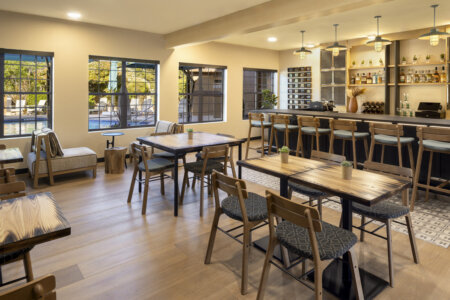
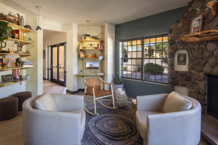
Our experience is that lobbies are becoming more like residential living rooms or social gathering places—lounges, really—that are more relaxed, less regimented than in the past. Front desks are adapting to suit these changes, especially now that hotel employees are no longer anchored to a computer terminal and can welcome a guest to a property the same way you would welcome someone to your home—come in, sit down, relax.
Retail’s Influence on Lobby Design
The separation of a lobby’s function (check-in/out, F&B, socializing, etc.) has become blurred and overlapping, much as it did years ago in Apple stores which did away (or at least minimized) dominant point-of-sale desks. Instead, the space is more like an extended lounge with roving team members who are able to properly greet new arrivals as well as offer assistance to whomever saunters by to ask a specific question, grab a drink at the bar or just use the free WiFi.
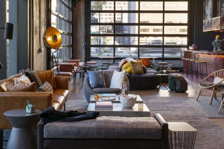
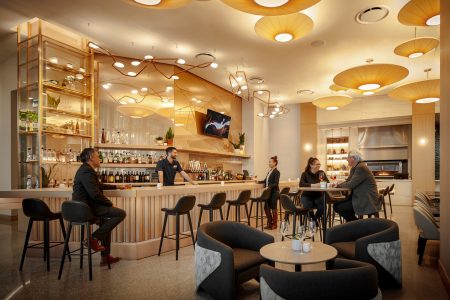
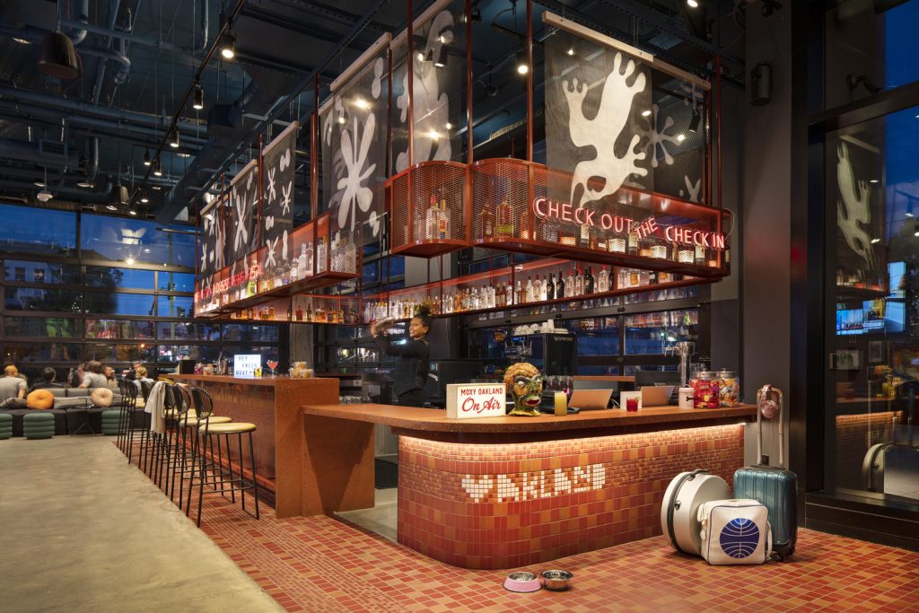
At Marriott’s Moxy brand, check-in takes place at the hotel bar rather than at a traditional front desk, which often includes a complimentary drink during the process. The benefits of this type of transaction are self-evident. Guests are greeted by highly trained hospitality professionals, in an environment that captures the vibe of the hotel and local neighborhood, and they get their stay off on the right foot with a free drink. Afterall, once you have one drink, you’re more likely to have another or at least stop by again during your stay, mingle with other guests, or say hello to the bartender you’ve already interacted with. Prolonging this experience means more time to take in the curated design of the space, get comfortable, and leave feeling more like a friend than a guest.
Rethinking the Check-In Sequence
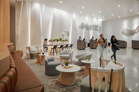
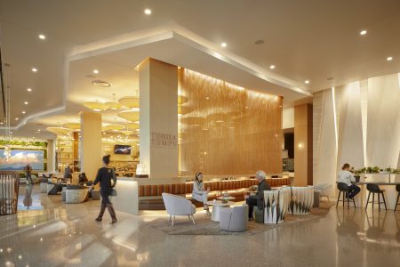
At the Westin Tempe, we created an archipelago of podiums that feel more like pieces of sculpture than desks, allowing hotel ambassadors the ability to roam around the entire lobby area. The space blends seamlessly with the F&B and touch-down spaces for working or small meetings. Keeping with the area’s native landscape, and the brand’s emphasis on wellness, the space also relies on biophilic design to soften the edges and bring the outside in.
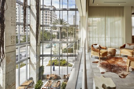
At the Canopy in West Palm Beach, we used the lobby to create a six-story “edge atrium” on the property’s northwest corner. The glazed volume creates a beacon along the street, blurring the line between indoor and outdoor space, and feels more like a trendy art gallery or event space than a hotel lobby. A variety of furniture clusters, changes in the ceiling planes and a healthy dose of green elements all create an oasis that blends social and F&B activities with the practical functions of check-in and concierge services.
As it has with every aspect of our lives, technology has changed the way we think about (and design) hospitality spaces. That’s par for the course. While our approach has been to remain plugged into the Zeitgeist and try to anticipate where the market is heading, our philosophy always places the guest at the center of the design. That has never let us down.
Featured Image: Sheraton Phoenix Downtown | Photo courtesy of Marriott Hotels, Sheraton Phoenix Downtown; Photographer: Werner Segarra


